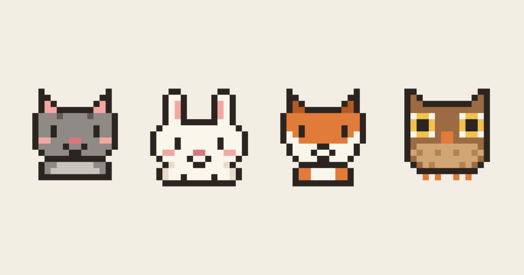
Cute pixel art isn’t about talent or fancy software. It comes down to a few simple, repeatable choices: how big the head is, where the eyes go, and how many colours you allow yourself. This guide walks through those choices, then draws four animals from start to finish so you can see exactly where every pixel goes.
All four examples come from our Animal Sprite Collection and are drawn on a 16 × 16 grid. That’s just 256 pixels, which makes it the perfect size to learn on: small enough to finish a whole animal in one sitting, but big enough to give it a face full of personality.
Before you start
- Any pixel art editor. Aseprite is the favourite of most pixel artists, while Piskel and Pixilart are free and run in your browser. Graph paper and coloured pencils work too.
- A 16 × 16 canvas, zoomed in until each pixel is a comfortable square to click on.
- The pencil tool at 1 pixel, with anti-aliasing and smoothing switched off. You want every pixel to be a hard, solid square.
- A second, small preview window showing the sprite at its real size, if your editor has one. Checking it as you go is the quickest way to tell whether something reads.
The five rules of cute
Before picking up the pencil, it helps to know what makes something look cute in the first place. These five rules come up again and again across all twenty animals in the pack.
1. Big head, small body
Baby animals have large heads and short bodies, and our brains read those proportions as cute. In most of our sprites the head takes up around three-quarters of the canvas, and the body is just a strip two or three pixels tall underneath. Don’t worry about legs or necks: at this size a row of feet or a hint of a belly is enough.
2. Soft, rounded shapes
Round corners off by stepping the outline in by one pixel at a time. A square head with each corner stepped in once already reads as round at 16 × 16. Save sharp points for the features that really need them, like a fox’s ears.
3. Eyes low and wide apart
This is the single biggest change you can make. Place the eyes at or slightly below the middle of the head, and leave a generous gap between them. Simple eyes also beat detailed ones: most of our animals use eyes that are just one pixel wide and two pixels tall.
4. A touch of blush
One or two soft pink pixels under each eye instantly make a character look warmer and friendlier. It’s the smallest detail in the collection, and the one people mention most.
5. Few colours and a soft outline
Aim for four to six colours per animal. Outline in a very dark warm brown such as Ink (#2B2420) instead of pure black. It still reads as black at a glance, but it sits far more gently next to pastels and creams.
The five-pass method
Every animal below is drawn in the same five passes. Working in this order means you fix big problems while they’re still cheap to fix, and you never spend time shading a shape that turns out to be wrong.
- Silhouette. Block in the whole shape in one flat colour. If you can’t tell what the animal is from this alone, change the shape now.
- Outline. Trace the edge of the silhouette with a single-pixel line in your dark outline colour, then clear the inside.
- Flat colour. Fill each area with one base colour: fur, belly, inner ears.
- Shading and markings. Add a darker tone where light wouldn’t reach, plus any stripes, spots or patterns.
- Face last. Eyes, nose, mouth and blush go in at the very end, once you can judge them against the finished body.
Leaving the face until last feels strange at first, but it’s the most important part of the character. Once everything else is in place, you can try the eyes a pixel up, down, in and out, and pick the version that feels right.
Example 1: The cat
The cat is the best place to start, because it’s really a template. Swap the ears and the colours, and the same head shape becomes a bear, a mouse, a panda or a hamster.
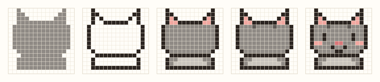
- Silhouette: Draw a wide rectangle for the head, fourteen pixels across, and step each bottom corner in by a pixel to round it off. Add two ears as narrow triangles that climb up to the top row, then a short body underneath, slightly narrower than the head.
- Outline: Trace the edge, and add one horizontal line across the canvas to separate head from body. That single line is all it takes to suggest a chin.
- Flat colour: Fill the fur with Stone (
#8F8A85), the inner ears with Blush (#F2A7A0) and the belly with a lighter Mist (#C9C4BD). - Markings: Two pixels of Charcoal (
#5F5A56) on the forehead suggest tabby stripes. That’s the only shading the cat needs. - Face: Each eye is a 1 × 2 pixel column with six pixels between them. Put a two-pixel Rose (
#D9787A) nose in the centre, a four-pixel smile underneath, and two blush pixels on each cheek.
Count the colours and you get six, including the outline. For a whole cat, that’s not many at all.
Moving the face around
To see how much the face matters, here’s the same cat with only its face pixels changed:

With the eyes high up, the cat looks older and surprised. Closer together, it looks focused, even a little cross. Without the blush it’s fine, but flatter. Only the last version has eyes low and wide apart and a little blush, and that’s the one that looks cute. Whenever a sprite feels off, try nudging the eyes before you change anything else.
Example 2: The bunny
The bunny teaches the most useful trick in tiny pixel art: exaggerate the one feature that defines the animal. Real rabbit ears are long, but these ones take up more than a third of the canvas. That’s what makes it unmistakably a bunny, even as a solid grey shape.

- Silhouette: Make the head the full width of the canvas and keep it short, so it looks soft and squashy. The ears are two columns, each two pixels wide inside the outline, rising almost to the top edge.
- Flat colour: Fill everything with Cream (
#FBF6EC) rather than pure white, and run a three-pixel stripe of Blush (#F2A7A0) down the inside of each ear. - Shading: White animals are tricky, because there’s no lighter colour to work with. Instead, add a pale, warm shade, Oat (
#E6DCC9), only along the lower sides of the body. Leave the face completely unshaded so it stays bright. - Face: The eyes sit low, just above the nose, with six pixels between them. The nose and blush cheeks share the row directly underneath, with a tiny mouth below.
Five colours in total. For light-coloured animals the outline does most of the work, so make sure it’s clean and continuous all the way round.
Example 3: The fox
The fox uses just four colours, including its outline. Here the face isn’t drawn with lines at all: it’s made by the shape where two colours meet.
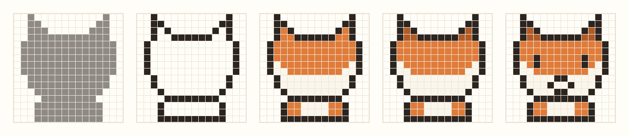
- Silhouette: Similar to the cat, but the ears are sharper and the bottom of the head narrows, stepping in a pixel at a time, into a pointed chin.
- Flat colour: Here’s the key step. Fill the top of the head with Ember (
#E07B39), then paint a Cream (#FBF6EC) mask that sweeps up both cheeks and fills the muzzle. That cream shape is what makes it a fox rather than an orange cat. Echo it with a little cream chest on the body. - Shading: Darken the inner ears with Rust (
#B35A26). Six pixels is all it takes to give the ears depth. - Face: Place the eyes in the orange, just above the cream cheeks, so the mask frames them from below. The nose is two pixels of outline colour at the tip of the muzzle, with a tiny mouth below.
Whenever an animal has bold markings, like a fox’s mask, a panda’s eye patches or a penguin’s white front, block them in as flat colour shapes. They’ll do far more work than outlines or shading ever could.
Example 4: The owl
The owl breaks one of the rules, and that’s worth knowing too. Most of our animals have tiny eyes, but an owl’s eyes are its defining feature, so here they’re exaggerated instead: together they cover more than half the width of the head.

- Silhouette: A tall, rounded body with two small ear tufts at the top corners, and four single-pixel toes sticking out at the bottom.
- Flat colour: Use Bark (
#9C6A43) for the head and wings, and Sand (#D2A574) for the belly. Draw each eye as a 4 × 4 square of Honey (#F2C14E), then swap the four corner pixels for Cream (#FBF6EC). Knocking the corners off a square is the easiest way to draw a circle at this size. - Markings: Scatter a few pixels of Toffee (
#B38452) across the belly in staggered rows. You don’t need to draw every feather; a simple repeating pattern suggests texture far better. - Face: Put a 2 × 2 pupil in the centre of each eye and a 2 × 2 beak of Ember (
#E07B39) between and just below them.
At seven colours, the owl is one of the busiest sprites in the pack. Even so, notice that every colour has a clear job.
Common mistakes and how to fix them
- Wobbly curves (jaggies). When an outline steps diagonally, keep the steps even: 1-1-1 or 2-2-2, or lengths that shrink steadily like 3-2-1. A sudden 1-3-1 looks bumpy.
- Thick corners (doubles). Where a line turns a corner, you’ll often get an L-shaped clump of three pixels. Remove the inner pixel so the line stays one pixel thick.
- Pillow shading. Shading evenly around every edge makes a sprite look puffy and flat at the same time. Pick a direction for the light, usually from above, and shade only the side facing away from it.
- Too much detail. Whiskers, teeth, claws and individual feathers turn to noise at 16 × 16. If a detail is smaller than about two pixels, leave it out or suggest it with a single pixel.
- Eyes too high. It’s the most common reason a sprite looks “off” without any obvious cause. Drop them a pixel and look again.
The best all-round test is to zoom out until the sprite is its real size on your screen. If it still reads as the animal, you’re done. If it doesn’t, the problem is almost always the silhouette, not the details.
Try it yourself
Here’s a good first exercise. Draw the cat by following the steps above, then turn it into three new animals by changing only the ears and the colours:
- A bear: small, round ears and warm brown fur.
- A mouse: big, round ears in grey with pink insides.
- A panda: round black ears and black eye patches on white.
You’ll find the same head shape doing a surprising amount of work, and by the end you’ll have a little set of four animals that look like they belong together.
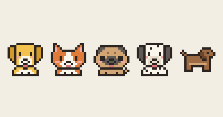
And if you’d like to skip ahead, or simply want all twenty animals to learn from, the full pack is below.
2 comments